Savr Recipes
A Google Venture Sprint Report
OVERVIEW
About Savr Recipes:
Savr Recipes is a mobile app that showcases recipes and tips, and has a huge community of users that rate and review recipes. However, there have recently been negative reviews about some of its recipes. Users ended up disappointed with how their dishes turned out because the preparation instructions, cooking steps were not clear or easy to complete.
Project DescriptionDuration: 5 days
Location: Mostly Remote (Euless, TX) Role: Sole UI/UX Designer Tools Used: Figma, FigJam, G. Docs UX Deliverables
|

|
Problems
- Timing of steps within a recipe.
- Order of steps not being clearly defined, or in an inefficient order.
- The need to learn new techniques that may not be outlined within a recipe.
Constraints
- Savr Recipes has an established logo and branding color etc.
- Logging in and Signing Up has been very effective.
- Finding Recipes easily is known as its strength.
Opportunities
Savr Recipes has negative user feedback mostly on the recipe instructions screen. Referring back to the users’ response about failing to inform the ingredients and kitchenware beforehand, adding those details on the introduction screen can work better. Clean design of the cooking steps with photos can contribute to a better user experience. And voice commands can be added so that users don’t have to wash hands repeatedly to refer back to the phone for the instructions.
The Sprint Process
As I was the sole designer, I followed the slightly modified GV Sprint process for the project. The major activities during each day of the sprint are as follows:

DAY ONE
Highlights:
- Analyzed users versions aligning with the problem statements.
- User Persona depiction
- User Interview and synthesis
- Created User Journey Maps and Refined it.
Research Analysis
Savr Recipes has got a lot of reviews from their app and they have shared some of the quotes from their users which shows the problems they are facing and the expectation they want Savr Recipe to improve. I presented some of the quotes and brought out the conclusion including their expectations from the app.

Concluding user needs:
- Preparation beforehand
- Relevant picture in each steps
- List of ingredients and kitchenware
- Proper instructions and timing
- Less referring back to phone
User Persona
I was provided with the details about a persona by Joe, the lead researcher from bitesizeux.com. The persona info was in elaborated form and I myself visualized the details with a few important categories for better understanding of the problem.

User Interview
After reviewing the videos and research provided, I was better able to understand the user pain points which gave me some insights on how to approach and solve this design challenge.

User Journey Map
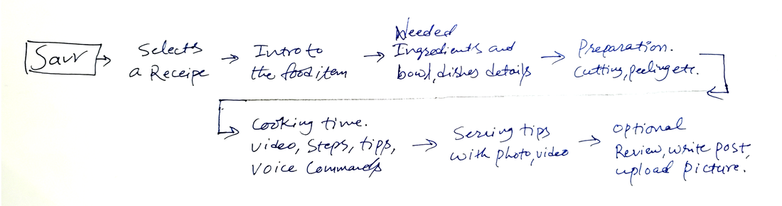
Initial User Journey
The journey map was ideated to provide separate screens for each major topics eg. Introduction, Ingredients & Kitchenwares, Preparation, Cooking, Serving and Review.
Refined and Elaborated User Journey
Initial User Journey had separate screens for Overview Screen and Ingredients Screen. But, while refining, I realized that users may not want to go to different screens for Ingredients and kitchenware. These things may change with the number of servings also. And they can make their mind up by looking at the list on the app and things available in their kitchen. So, keeping ingredients and kitchenware details on one screen can be more effective. Obviously, reducing the screens can make a better user experience.

Users can also drag to the bottom of the page for the user reviews. It also consists of the bowls, dishes or any other utensils needed for the cooking process.
Preparation screen guides thoroughly with the tutorial photo or video. The Instructions screen has a detailed tutorial video. It will give additional tips and preparation reminders if the cooking process is long and vast.
It also accepts voice commands. And after the cooking is finished, users can get some tips regarding the serving and they can post their reviews optionally.
DAY TWO
Highlights:
- Competitive Research and Lightning Demos
- Evaluated the strengths and weaknesses of the competitors for takeaways.
- Crazy 8s
- Selected and refined Most Critical Screens
Lightning Demos
Competitive Research:
For the reference of how other apps are offering the solution of such problems, I googled three websites from the same genre and collected some of their strengths and weaknesses.
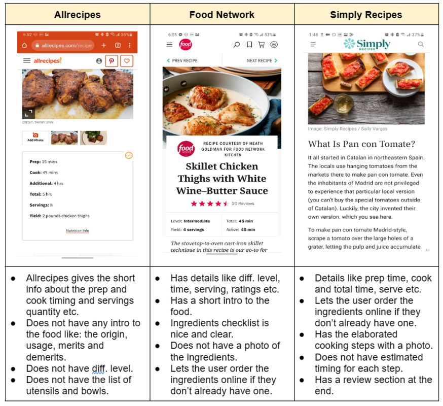
Primary Takeaways
Secondary Takeaways
Among these good points I referred back to the User Journey I created on Day-One to be aligned to major problems and solutions.
- A good short info about the food.
- Details like serving numbers, prep time, cook time and total time.
- All inclusive ingredients and kitchenware checklist with picture
- Clear cooking steps with respective photos.
Secondary Takeaways
- Let's the user order the ingredients online if they don’t already have one.
- Nutrition facts per serving.
- Review Section at the end.
Among these good points I referred back to the User Journey I created on Day-One to be aligned to major problems and solutions.
Crazy 8s
I took advantage of the competitive research of the competitors to make a sketch with some new and borrowed ideas from them. Here’s the picture of crazy 8 sketches:

I particularly liked and enjoyed Crazy 8s Sketching since it allowed me to try out all of my ideas and automatically iterate on them in a short period of time.
Most Critical Screen
Now that I had ideas for this crucial screen, I spent time creating a solution sketch. I started to improve the sketches in a way aiming for Savr users to go through step by step in a time efficient order. It also shows the video/photo of the recipe/activities of the particular steps. The selected steps have a countdown/timer associated with it. Users can use voice commands like Previous Step, Next Step, Repeat, Pause etc.

I selected four screens including two critical screens. The screen from left to right are: Overview, Preparation, Tutorial and Sharing Tips and Review Screen. Among them, Preparation and Tutorial screens are the most critical screens which are designed to solve the users’ problems. I also tried a few more sketches to refine the critical screens at the end of the day.
DAY THREE
Highlights:
- Re-sketched, refined the Most critical Screens.
- Decided final sketches with all UIs and basic interactions.
- Demonstrated the final sketches with notes.
- Reached out to the test participants.
Storyboard
While sketching my solutions I was overwhelmed with many new ideas but managed to stay focused on testing the major solution. Referring back to my HMWs, original user flow, and problem statements brought me back to the track. It was crucial to make sure that all three of the main problem statements had a proposed solution in the sketch. Reducing the number of screens definitely contributes to an easy, quick and smoother user experience.

DAY FOUR
Highlights:
- Created Wireframes
- Improved Wireframes to High Fidelity Screens
- Prototyped or wired up the screens
- Made follow up calls for Usability Tests
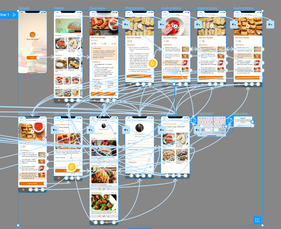
High Fidelity Screens
Day 4 of the Design Sprint was all about finishing the high fidelity prototypes ready to be tested. It took a whole day to complete the Hi-fi screens and prototyping.
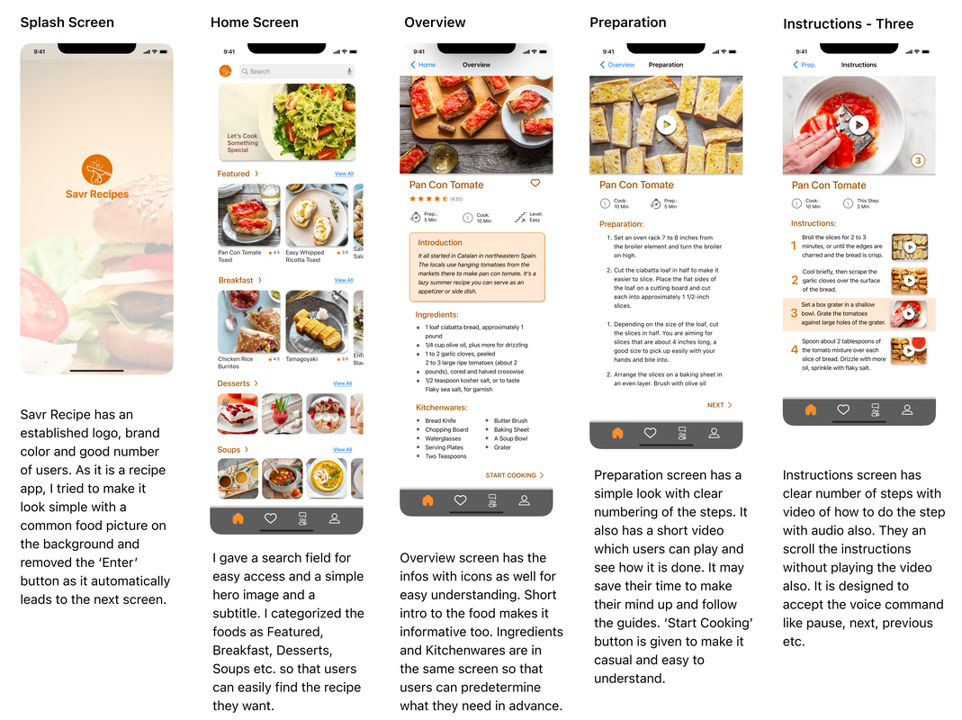
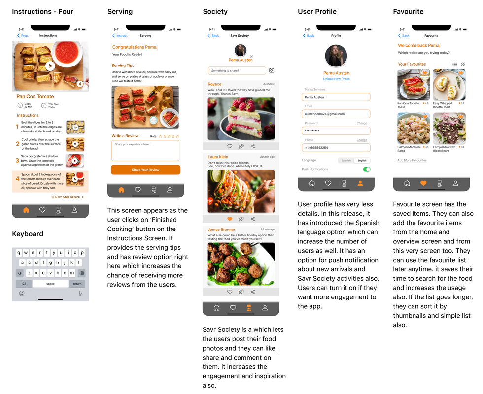
Preparation Screen and Instructions Screen are the most crucial screens as stated in the problem statements. Besides, Overview and Review Screens are also added for a better user experience.
For the pictures and recipes, the design relied on one of the competitors, Simply Recipes. After creating the Hi-fi Screens, wiring up the screens started. Follow up calls and emails were also sent to the participants for the user testing of the final prototypes.
Wiring up the Screens
I spent a few hours providing the details to the screens and wiring them up as well. I was trying to add a Voice Trigger feature in the prototype and very little time was remaining for Day 4. But, by the end of the day, Savr Recipe prototype was ready to be tested.
DAY FIVE
Highlights:
- Pre-test and preparation for Usability tests.
- Shared the prototypes with the participants.
- Usability Tests and Notes
- Analyzed the test notes and brainstormed for the iteration.
Usability Testing
I had already appointed some of my colleagues, neighbours and friends for the usability test of the prototype. I hoped to discover if the users find the prototype as a solution to the user problems and solutions aligned to my HMWs. I also expected them to find out the strengths and weaknesses of the solution I approached in the prototype.
I conducted the testing through one-on-one personal meetings with 5 participants. I presented my prototype and asked them to pick up a recipe and complete the process. The task I gave the five participants was simply done by all of them. Even if it took some of them longer than others, they eventually succeeded. Mostly, the prototype issues were discovered during the test that could be fixed quickly.
I conducted the testing through one-on-one personal meetings with 5 participants. I presented my prototype and asked them to pick up a recipe and complete the process. The task I gave the five participants was simply done by all of them. Even if it took some of them longer than others, they eventually succeeded. Mostly, the prototype issues were discovered during the test that could be fixed quickly.
Usability Test Findings
Critical Issues
- Two of the participants tried to find out the option to adjust the serving. And were looking for the nutrition facts per serving too.
Solution: It is possible to make the serving count adjustable and the ingredients and kitchenwares accordingly. And, nutrition facts too.
(Est. time: 4-6 hours) - Four of them also wanted to know the approx. timing of each cooking step.
Solution: It can contribute to a better cooking experience. Can be solved easily.
(Est. time: 1 hour) - One of my participants had concerns with mobile data.
Solution: It can be a common user problem indeed. I should also create a data friendly ‘image only’ recipe option.
(Est. time: 5-6 hours) - One of my participants did not know what ‘Grater’ is in kitchenware. And another one expected to see the image of ‘Kosher salt’ and ‘Flaky sea salt’ in the ingredients list.
Solution: The kitchenware list and ingredients list can be made clickable resulting in popping up of the related image.
(Est. time: 4-6 hours)
Prototype Issues and Minor Issues
- Three of the users tried to drag the carousels but it did not work.
Solution: The carousels can be improved.
(Est. time: 4-5 hours) - Two of them were trying to click on the recipe which I had not wired up.
Solution: All of the thumbnails and UIs can be made fully functional on V2.
(Est. time: 7-10 hours) - Most of the users wanted to see the recipe in the video. But the videos in the prototype were not clickable.
Solution: It would be great if the videos play in prototype. I will try if it is possible with Figma.
(Time not estimated)
Conclusion
This quick 5-day Sprint was an efficient way to learn about a problem and test a possible solution without investing too much time. I conducted the tasks allocated for each day of the sprint and also referred frequently to my mentor, the industry practices and examples.
Besides the solution of critical issues, the Sprint session Obviously, besides the solution of critical issues, all features can not be addressed in the MVP within a sprint. But this practice also opened up the door to other possibilities which can be tested in the upcoming Sprints or versions.
Besides the solution of critical issues, the Sprint session Obviously, besides the solution of critical issues, all features can not be addressed in the MVP within a sprint. But this practice also opened up the door to other possibilities which can be tested in the upcoming Sprints or versions.
Lesson Learned
Completing this Savr Recipe design sprint was challenging but enjoyable at the same time. During this project I learned about the major steps, theories and practices of GV Design Sprints, and I look forward to participating in future sprints too.
After the usability testing, I also learned that except from searching for vast and unique tricks, sometimes simple ideas can steal the show. For example, including a help option in case the user gets stuck at a certain step. Likewise, incorporating a shopping list feature, adding other language options can be a game changer.
Conducting a GV Sprint as a sole designer was very challenging. In some stages, I felt like it would be great and much easier to work and collaborate with a team of people. I realized that UX is not an individual process done in a silo.
